
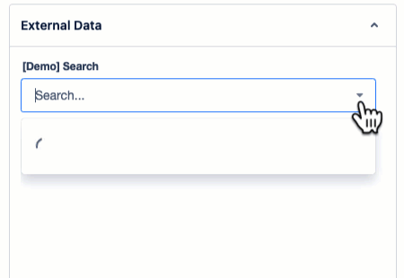
If you are setting up new Search Fields, we suggest using the Search Field (Custom Field) for the largest feature set and best compatibility.
Look up and write custom data from your database directly within your Jira work item: Explore how our default search works in detail and learn how to set up and use default search fields for your Jira work item to display relevant data on your work item screen in our step-by-step configuration guide.
Field Design and Functionality
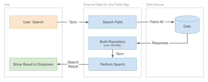
The default search function creates a comprehensive search index for the search field by loading and converting all your data items into a searchable repository.
The search is fully customizable. You can specify which of your fields should be searchable and which values should be written to a target field during the configuration of the search field. You do not need a specific external search endpoint to perform the search.
How to Setup and Configure a Search Field
Step-By-Step Video-Tutorial
Learn how to combine this search field with an info panel, enabling you to display in-depth search details on your screen in our detailed step-by-step video tutorial.
Configuration Guide
Data Source
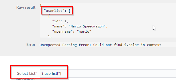
After selecting a data source the raw result of your data is being displayed below.
Example:
{
  "userlist": [
    {
      "id": 1,
      "name": "Mario Speedwagon",
      "role": "Owner",
      "alias": null
    },
    {
      "id": 2,
      "name": "Anna Sthesia",
      "role": "Developer",
      "alias": "Anna"
    }
  ]
}
Context Filter
Context Filter allows you to filter the search repository based on work item values (optional). You can define dependencies of the search on other fields (nesting) here.
Examples and details about Context Filter can be found in the dedicated section of the documentation.
Select List Repository
Add the JSON path including the name of your data list here. Please make sure to not just select a single value.
Example:
$.userlist[*]
ID Field
ID is the unique identifier that identifies an item within your data set (must be a unique number or string).
This field is used to identify a selected value later. You can use the same JSON path in the value field and the search field.
Example:
$.id
Search Field
Define the underlying field value(s) (again, as JSON path) that you want to use as basis for the search. Field values should always refer to the values in your data source.
(When a user starts typing in the search field, only the respective value(s) will be displayed as matches)
Example:
$.name
or
{$.name} {$.role} {?$.alias}
Using multiple fields like this will let you search in role, name & alias. It is important to use the ? for the alias field as it might contain null values (it will replace the alias with an empty string to avoid issuing an error because of a missing value).
Value Field
Define JSON path(s) to values in your data list that you want to be written to the target custom field once the user selects them.
Example:
$.name
This will write Mario Speedwagon into the target custom field
user:{$.name} role:{$.role} alias:{?$.alias}
This will write user:Mario Speedwagon role:Owner alias: into the target custom field
Value Label (optional)
Define JSON path(s) to the values in your data source that are supposed to be displayed as selected values later on. (Is the same as Value Field if left empty)
Example:
{$.role}: {$.name}
Result will be Owner: Mario Speedwagon
Search Template (optional)
Define the rendering of your dropdown list by using either JsonPath expressions or Mustache syntax.
Using JsonPath:
{$.name} - [{$.role}]
In this case, the name is going to be displayed first, followed by the role in brackets: Mario Speedwagon [Owner].
Using Mustache:
{{ name }} – [{{ role }}]
With the same attributes mentioned above, it will render as: Mario Speedwagon [Owner]. For further insights and more intricate template structures, visit our guide here -> Template Syntax
Min Query Size
With this value you can customize how many characters a user must type before the search will be triggered. Zero will trigger a search immediately.
Enable Multi-select
This options allows you to select more than one value. Values can be seperated either by ; or by {break}.
Example:
A selection of multiple values with the separator ; would look like this:
value1;value2;value3
By using Text Field (multi-line)/ Paragraph search values are being displayed in a vertical list. To accomplish this, set the separator to the following value:
{break}
This will enforce a single line per value and would look like this:
value1
value2
value3
When using a Labels field type, the separator will be ignored and each value will be its own label tag. When using a Labels field, be aware that whitespaces within a value will split the label into multiple label tags.
Target Behaviour
You can choose between the following two options:
-
Write value field (default, recommended)
-
Read and write ID field (advanced)
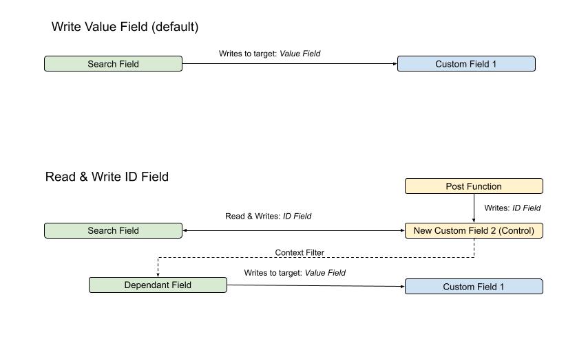
Write value field (default)
Writes the value field of the selected option(s) into the target field (one-way). You can use all sorts of value(s) here. Manual changes in the target field have no effect on the state of the search field.
Read and write ID field
Writes the value of ID Field of the selected option(s) to the target field. The ID field must always point to a unique entry in your select list respository. A manual or automated change of the target field will also change the state of the search field.
Target Jira Field
Target Jira Field defines the Jira custom field to which the value(s) of the selected options are being written to. You can specify those value(s) in Value Field.
In case you use a Select-List as a target field no options are synced to that field, but only the selection will be written. This also means, that the value you try to write must be already available as an option in the target field (which is rarely the case).
Work Item Refresh (Advanced Option)
If activated, this field will trigger a work item page refresh after a value is selected or deselected. A work item page refresh is useful if you want any change to be reflected in the target field without a manual page refresh. A work item refresh can affect usability and performance as it will fully reload all fields.
Filter Match (Optional)
You can filter the search to only match specific spaces, work types or request types. By selecting Any, you’ll get results that matches any of the selected filters while choosing All means, all of the defined filters must apply for matches in order to be shown.
Jira Service Management
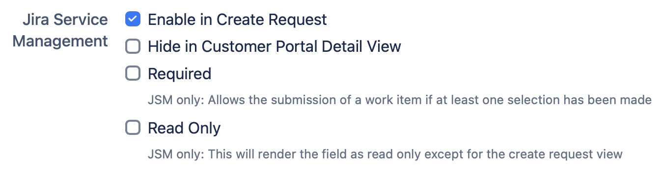
Jira Service Management consists of:
-
Enable in Create Request
Enables this field on the create request screen of the Jira Service Management customer portal. You can use filter section to define which Request types shows this field. -
Hide in Customer Portal Detail View
This option hides the JSM fields in the Customer Portal Detail View. However, if 'Enable in Create Request' is selected, users can still select the JSM field when creating a request, but it will not be visible in the Portal Detail View. -
Required
This will allow the user to submit the work item only if one selection has been made -
Read Only
This will render the field as read only except for the create request view
Combining Fields
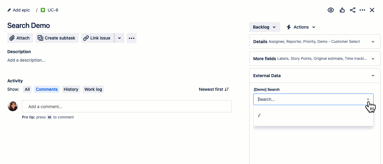
A search field can be combined with an Info Panel or a dependant field. Use this option whenever you want the search to output additional search-related informations and/or custom fields.
Positioning
Search Fields can either be displayed on the left side below the work item content or at the right side (example below) as menu element.
When you’re using multiple search fields in combination with info panels you might want to put them in a specific order. By default fields are sorted by name (ascending).
Example:
To overrule the default settings for two different search fields, use the Position field for the search you want to appear below the other one by choosing a value higher than 1. The field with the lowest number will appear at the top.
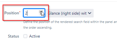
Note: For usability reasons, numbers can also be 0 or lower.